In an increasingly mobile-first world, the user experience (UX) on mobile devices has become a critical factor in a business’s success. For small businesses, optimizing mobile UX is not just a nice-to-have but a necessity.
With more consumers relying on their smartphones for everything from shopping to social media to information search, ensuring that your mobile presence is seamless, intuitive, and user-friendly can significantly impact customer engagement and conversions. In this post, we’ll dive deep into what mobile UX is, why it’s crucial for small businesses, where to focus your improvements, when to evaluate your mobile UX, and practical tips to enhance it.
What is Mobile UX?
Mobile UX, or mobile user experience, refers to how users interact with a website, application, or digital content on a mobile device, such as a smartphone or tablet. It encompasses all aspects of the user’s interaction, including the visual design, navigation, content layout, load time, and overall ease of use.
In today’s digital landscape, where mobile internet usage has surpassed desktop usage, providing an excellent mobile UX is essential. A well-designed mobile UX ensures that users can easily navigate and interact with your website or app, regardless of the device they are using. Poor mobile UX can lead to frustration, increased bounce rates, and ultimately, lost customers. Therefore, understanding and optimizing mobile UX is a critical step for businesses looking to thrive in the digital age.

Why is Mobile UX Critical for Small Businesses?
For small businesses, every interaction with a customer counts. Unlike large corporations, which may have the resources to weather a few negative experiences, small businesses often rely on a much smaller customer base, making each customer’s experience vital. Here’s why mobile UX is particularly important for small businesses:
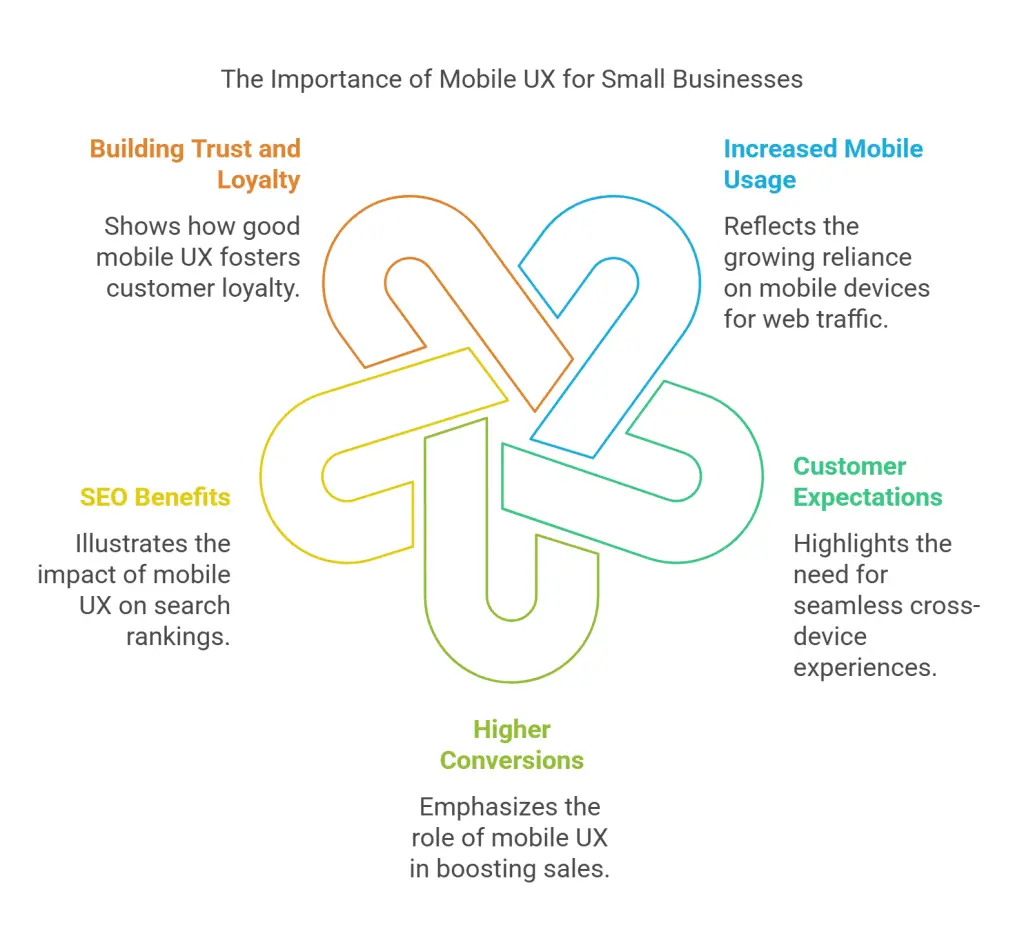
- Increased Mobile Usage: As of 2024, more than half of all web traffic comes from mobile devices. This trend shows no signs of slowing down, making it essential for small businesses to cater to mobile users effectively.
- Customer Expectations: Modern consumers expect a seamless experience across all devices. If your website or app doesn’t function well on mobile, potential customers are likely to leave and never return. In fact, studies have shown that 88% of users are less likely to return to a site after a bad experience.
- Higher Conversions: A well-optimized mobile UX can lead to higher conversion rates. When users can easily navigate your site, find the information they need, and make purchases without any friction, they are more likely to complete their transactions. For small businesses, this can be the difference between growth and stagnation.
- SEO Benefits: Mobile-friendliness is a significant factor in search engine rankings. Google, for instance, uses mobile-first indexing, meaning that it primarily uses the mobile version of a site for ranking and indexing. Poor mobile UX can hurt your visibility on search engines, making it harder for potential customers to find you.
- Building Trust and Loyalty: A seamless mobile experience can enhance customer satisfaction, leading to repeat business and word-of-mouth referrals. On the other hand, a poor experience can quickly erode trust, causing potential customers to turn to competitors.

Where to Focus Your Mobile UX Improvements?
Improving mobile UX can seem overwhelming, especially with limited resources. However, by focusing on key areas, you can make significant strides in providing a better experience for your users. Here are some critical areas to concentrate on:
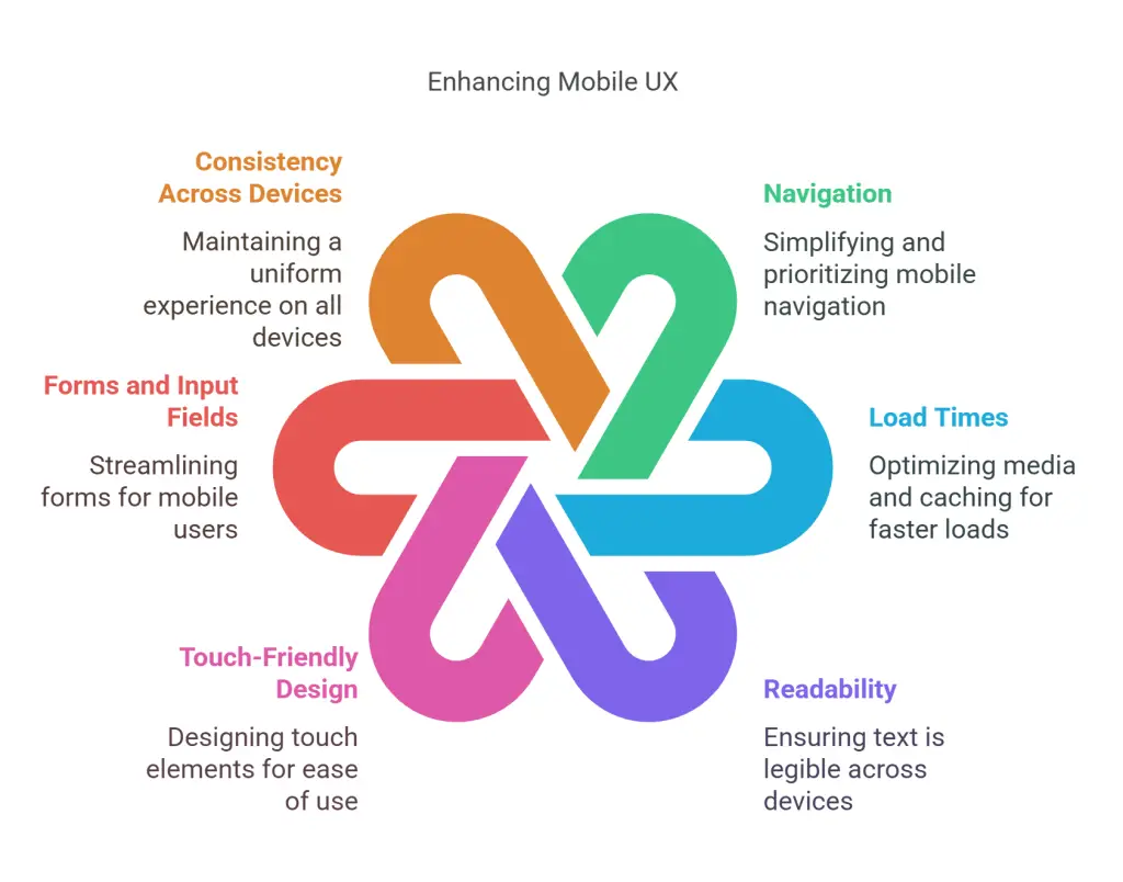
- Navigation:
- Simplify Menu Structures: On mobile devices, space is limited, so it’s essential to keep navigation simple and intuitive. Avoid overcrowded menus; instead, use a hamburger menu or bottom navigation bar to keep the interface clean.
- Prioritize Essential Links: Ensure that the most critical sections of your website, such as product categories, contact information, and the shopping cart, are easily accessible from the main screen.
- Use Gestures Wisely: Incorporate common mobile gestures, like swiping and pinch-to-zoom, to make navigation more intuitive. However, ensure these gestures are consistent and easy to discover.
- Load Times:
- Optimize Images and Media: Large images and videos can slow down your site significantly on mobile. Use compressed images and adaptive streaming for videos to reduce load times.
- Leverage Browser Caching: Enable caching so that your site loads faster on repeat visits by storing some data on the user’s device.
- Minimize HTTP Requests: Reduce the number of elements on your page that need to be loaded individually, such as scripts, images, and stylesheets, to improve load times.
- Readability:
- Responsive Typography: Ensure that text scales appropriately on different screen sizes. Use a legible font size (at least 16px) and avoid long blocks of text.
- Contrast and Color Choices: Use high-contrast text and background colors to enhance readability, especially in different lighting conditions.
- Break Up Content: Use bullet points, short paragraphs, and headers to make content easier to digest on small screens.
- Touch-Friendly Design:
- Larger Touch Targets: Ensure that buttons and links are large enough to be easily tapped with a finger. A minimum size of 44×44 pixels is generally recommended.
- Spacing: Provide adequate spacing between touch elements to prevent accidental taps, which can lead to frustration.
- Forms and Input Fields:
- Simplify Forms: Only ask for essential information and use auto-fill features to minimize typing. Multi-step forms can help break down long forms into more manageable sections.
- Mobile-Friendly Input Types: Use appropriate input types (e.g., email, number, date) that trigger the right keyboard on mobile devices to make data entry easier.
- Consistency Across Devices:
- Responsive Design: Ensure that your website or app looks and functions consistently across all devices, including different screen sizes and orientations.
- Cross-Platform Sync: If your business operates across multiple platforms (e.g., web and mobile app), ensure that user data syncs seamlessly between them for a consistent experience.

When to Evaluate and Update Mobile UX?
Mobile UX is not a one-and-done task; it requires regular evaluation and updates to stay effective. Here’s when and how often you should assess your mobile UX:
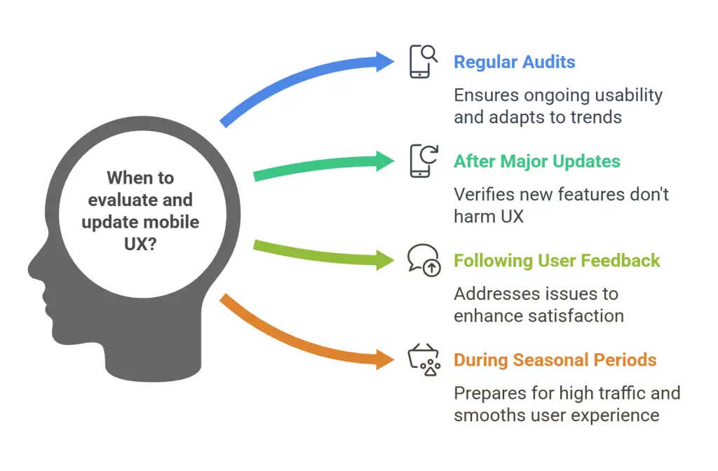
- Regular Audits: Conduct a comprehensive mobile UX audit at least twice a year. This should include usability testing, analyzing user behavior data, and reviewing design trends and technological advancements. Use tools like Google Analytics, Hotjar, or UserTesting to gather insights into how users are interacting with your mobile site or app.
- After Major Updates: Whenever you make significant changes to your website or app, such as redesigns or new feature implementations, conduct a mobile UX review to ensure these updates haven’t negatively impacted the user experience.
- Following User Feedback: Pay attention to user feedback, especially complaints or suggestions related to mobile experience. Addressing these issues promptly can prevent larger problems and improve overall satisfaction.
- During Seasonal or Promotional Periods: Before peak seasons, such as holidays or major sales events, review and optimize your mobile UX to ensure it can handle increased traffic and provide a smooth experience for users during these critical times.
- When Analyzing Performance Metrics: If you notice a drop in mobile conversion rates, higher bounce rates, or a decrease in average session duration, it’s time to re-evaluate your mobile UX. These metrics often indicate underlying issues with the user experience.

Tips for Optimizing Mobile User Experience
Improving mobile UX is a continuous process that involves staying up-to-date with best practices and user preferences. Here are practical tips to help you create a seamless mobile experience:
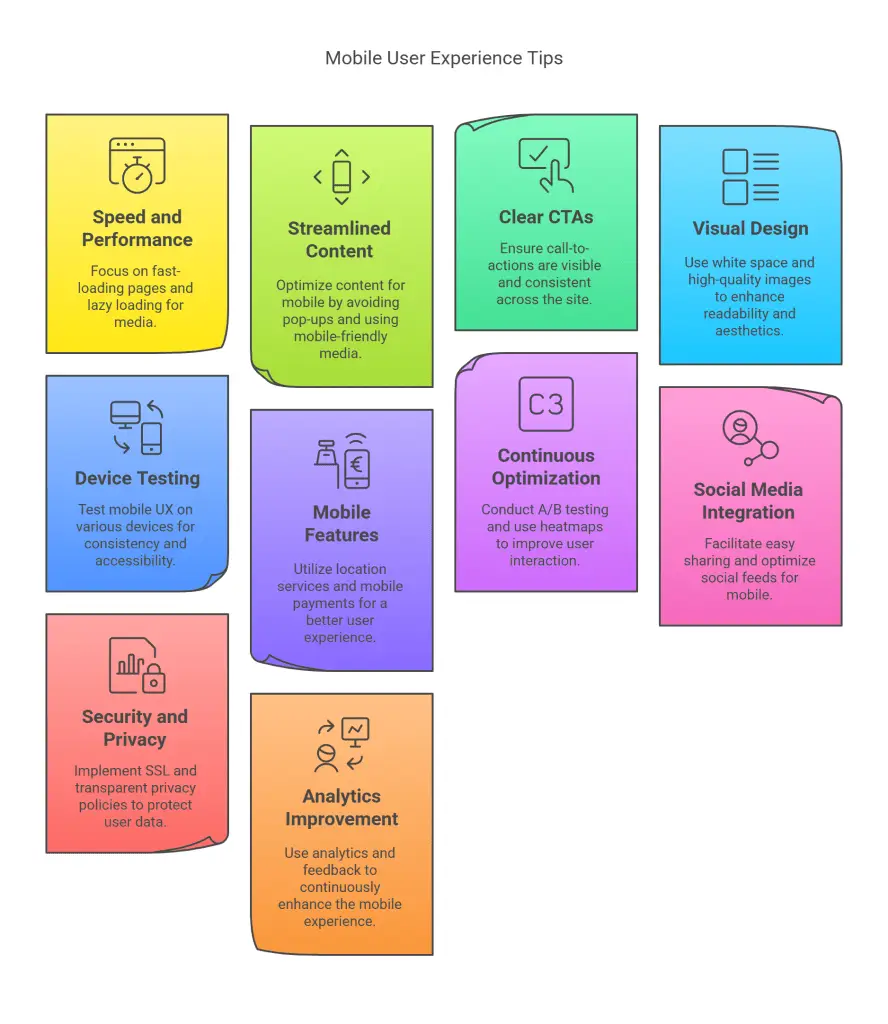
- Prioritize Speed and Performance:
- Use Accelerated Mobile Pages (AMP): AMP is a framework that helps create fast-loading mobile pages. Consider implementing AMP for your most important pages, like product listings or blog posts.
- Lazy Loading: Implement lazy loading for images and videos, so they only load when they come into the user’s viewport. This can significantly improve load times.
- Streamline Content for Mobile:
- Avoid Pop-ups: Intrusive pop-ups can frustrate users on mobile devices. If you must use pop-ups, ensure they are easy to close and don’t obstruct the main content.
- Use Mobile-Friendly Media: Ensure that videos and other media are optimized for mobile playback. Avoid Flash, as it is not supported on many mobile devices.
- Emphasize Clear Call-to-Actions (CTAs):
- Positioning: Place CTAs where they are easy to see and tap. For example, place the primary CTA button above the fold and use contrasting colors to make it stand out.
- Consistency: Keep your CTAs consistent in design and wording across all pages to avoid confusion.
- Enhance Visual Design:
- Use White Space: White space helps break up content and makes your mobile site look cleaner and more organized. This improves readability and prevents the interface from feeling cluttered.
- High-Quality Images: Use sharp, high-quality images that are optimized for mobile devices. Avoid using low-resolution images that can appear pixelated on high-density screens.
- Test Across Multiple Devices:
- Real-World Testing: Test your mobile UX on a variety of devices, including different brands and operating systems, to ensure a consistent experience. Emulators and simulators can also be useful, but nothing beats real-world testing.
- Accessibility Testing: Ensure your mobile site is accessible to users with disabilities. This includes providing alt text for images, ensuring good contrast for readability, and making your site navigable with screen readers.
- Leverage Mobile-Specific Features:
- Location Services: Use location-based services to offer personalized content or deals to users based on their geographical location.
- Mobile Payments: Simplify the checkout process by integrating mobile payment options like Apple Pay, Google Wallet, or PayPal, which allow for faster and more secure transactions.
- Monitor and Optimize Continuously:
- A/B Testing: Regularly conduct A/B tests on different elements of your mobile site or app, such as buttons, forms, and content layouts, to see what works best for your users.
- Heatmaps: Use heatmaps to understand where users are clicking, tapping, or scrolling on your mobile site. This can help you identify areas of improvement or highlight elements that may need redesigning.
- Integrate Social Media Seamlessly:
- Social Sharing: Make it easy for users to share your content on social media directly from their mobile devices. Use sticky social sharing buttons that are always accessible without being intrusive.
- Mobile-Optimized Social Feeds: If you display social media feeds on your site, ensure they are optimized for mobile viewing and don’t slow down the page.
- Focus on Security and Privacy:
- SSL Certification: Ensure your mobile site is secure by implementing SSL certification. This not only protects user data but also boosts your site’s credibility and search rankings.
- Transparent Privacy Policies: Clearly communicate how user data is collected and used, especially on mobile forms and during transactions. Make sure this information is easy to access and understand.
- Leverage Analytics for Continuous Improvement:
- User Behavior Analytics: Use tools like Google Analytics, Mixpanel, or Amplitude to track how users interact with your mobile site or app. This data can provide insights into user preferences and pain points, allowing you to make informed improvements.
- Feedback Loops: Implement feedback loops such as in-app surveys or feedback forms to gather direct user input on their mobile experience. This can help you identify issues that may not be apparent from analytics alone.

Conclusion
Delivering an exceptional mobile user experience is no longer optional—it’s a requirement for success. For small businesses, a well-optimized mobile UX can be a powerful differentiator that enhances customer satisfaction, increases conversions, and drives long-term growth.
By focusing on key areas such as navigation, load times, readability, and touch-friendly design, small businesses can create mobile experiences that delight users and keep them coming back. Regular evaluation and updates, coupled with continuous optimization based on user feedback and behavior analytics, ensure that your mobile UX stays ahead of the curve.
As you embark on the journey to improve your mobile UX, remember that the ultimate goal is to make it as easy and enjoyable as possible for users to interact with your business on their mobile devices. By doing so, you’ll not only meet the expectations of today’s mobile-savvy consumers but also position your business for sustained success in an increasingly mobile world.
Further reading
UXCam. “Mobile UX: Best Practices for Optimizing Your App.” Last accessed February 3, 2025. https://uxcam.com/blog/mobile-ux/.
Interaction Design Foundation. “Master Mobile Experiences from IXDF Course.” Last accessed February 3, 2025. https://www.interaction-design.org/literature/article/master-mobile-experiences-from-ixdf-course.
Toptal. “Mobile UX Design Best Practices.” Last accessed February 3, 2025. https://www.toptal.com/designers/ux/mobile-ux-design-best-practices.
Netguru. “Mobile UX Best Practices: How to Create User-Friendly Mobile Experiences.” Last accessed February 3, 2025. https://www.netguru.com/blog/mobile-ux-best-practices.
SiteTuners. “5 Best Practices to Improve Your Mobile Experience.” Last accessed February 3, 2025. https://sitetuners.com/blog/5-best-practices-to-improve-your-mobile-experience/.
Medium. “Mobile-First Design: Optimizing User Experience for Mobile Devices.” Last accessed February 3, 2025. https://medium.com/design-bootcamp/mobile-first-design-optimizing-user-experience-for-mobile-devices-09632c8a2202.


